No matter which company you represent, or how much time and money you spend on marketing for your website, there have probably been many occasions where at least some of your website visitors have had trouble interacting with your site and instead of converting, have been forced to look elsewhere or give up altogether.
Why would this happen? Quite simply, the user was not able to complete the desired action on your site. Be it making a purchase or simply signing up to a newsletter, we can see that all conversion funnels are affected by a website’s usability and accessibility.
From a marketing perspective companies that do not pay serious attention to the accessibility and usability of their website are not only going to damage their own professional reputation, they also run the risk of alienating even their most loyal customers.
Listen to your website visitors
When working with a client in the past, a member of the sales team once told me that many of his long standing customers had complained about the confusing navigation on the company’s new website. They had tried to make enquiries via the website but had given up after not even being able to locate the appropriate “Contact Us” page link. They had found the website easily enough via the usual channels, but had been faced with all sorts of problems once they landed there. In this situation the customer was able to telephone his sales account manager but this issue had very worrying implications for the marketing team. How many of their new website visitors were abandoning their sessions on the company website, and not because the company did not provide what they were looking for, but simply because of ineffectual landing page designs, confusing website navigation and even simply having your main “Contact Form” or “Buy Now” call to action buttons below the fold on landing pages. These sorts of problems can all contribute to a not only frustrating user experience, but also can drive people away from your site because they find it near impossible to use.
In the example I mentioned above, the company had gone about designing its website based on what features each member of the marketing team thought it should include and although they were all good ideas (from a customer service perspective), no thought however seemed to have gone into how the user was supposed to interact with the site and access these features. More importantly perhaps, the company did not approach its customers to see what they wanted from a website or what they thought a good layout for the site should be.
In his book “Don’t Make Me Think: A Common Sense Approach to Web Usability,” author Steve Krug writes:
Usability really just means making sure that something works well: that a person of average (or even below average) ability and experience can use the thing – whether it’s a website, a fighter jet, or a revolving door – for its intended purpose without getting hopelessly frustrated.
There are clearly many factors which can affect a user’s ability to interact with your company website and therefore this will naturally impact your online sales and conversions. I have already mentioned some examples of these issues, confusing navigation or badly placed “call to action” buttons are all aspects of usability which will affect your conversion rate.
There are many simple design and layout guidelines to improve usability and most of them will seem very obvious to many. Below I have outlined some of the most important.
Make sure action buttons appear “clickable”
For instance, make sure your buttons look like buttons. Sounds simple right? If you want somebody to click on an action button on your landing page that will take them to a checkout or contact form, you want that button to be obvious to the user. There should be no ambiguity as to whether something is clickable or not. Check out heat maps for your websites and make sure that users are clicking where you want them to click. If they are not, chances are that there is something fundamentally wrong. You do not want users to be put off by the sheer simple fact that they did not know where to click next. Website users are extremely impatient and get frustrated easily so you need to do as much of the work for them as you can.
Clear purpose
Make sure that each page of the website is self-explanatory. A user should never be on a page and have to think about the purpose of that page. Is the page there to give information on a particular product or service? If so, make sure that there are some good straightforward images of those products that will dispel any confusion from the page visitors as soon as they land there.
For instance, imagine a company sells fluorescent tubing to other manufacturers. A page on their website is dedicated to fluorescent tubing; they list some of their prices on the page and even include some warranty and other product information. There is a “Buy Now” call to action button on the page so it is clear that this page is selling something. However, the image at the top of the page shows a classroom full of children. They are in a room illuminated by fluorescent lighting. Imagine further, a visitor finds this page on fluorescent tubing through a paid search campaign; they are looking for “fluorescent tubing suppliers”, however, the first thing they see when they land on this page is the picture of a classroom full of children. The web visitor works for a company that build factories. They might instantly realise that this is a page selling lighting but the picture demonstrates a different application of the product than they were expecting to see. The visitor is starting to ask, “Is this the correct page for me?”
When it comes to using the web we are all quite selfish, we want everything to be catered specifically ourselves and therefore if we do not see the product we want, as we want to see it, we are instantly turned off. How many of these confused new visitors will read on to see if the page is actually related to the product or service they are looking for? It turns out, surprisingly few – despite the fact that we like to think that all of our web visitors spend time reading our well thought out copy.
In fact, unless you are a blogger or Wikipedia, most visitors simply do not bother to read the content. In many cases the best you can hope for is for your visitors to scan your copy and hope that it does a good job in itself to explain what the page is offering. The trick is to tell the visitor that they are in the right place straight away with the correct choice of image. So if your product can have multiple applications, make sure your top image shows that or at the very least, shows the product on its own so there can be no confusion in the users mind that this IS the page they are looking for.
Accessibility
Accessibility issues can be even more detrimental to our conversion rates. The World Wide Web Consortium (W3C) writes on their website: “The Web is fundamentally designed to work for all people, whatever their hardware, software, language, culture, location, or physical or mental ability. When the Web meets this goal, it is accessible to people with a diverse range of hearing, movement, sight, and cognitive ability. Thus the impact of disability is radically changed on the Web because the Web removes barriers to communication and interaction that many people face in the physical world. However, when websites, web technologies, or web tools are badly designed, they can create barriers that exclude people from using the Web.”
Designing an accessible website in this case is about trying to ensure that people who may have difficulties can perform the same actions as people who do not face those difficulties. There are many things to think about. Does your website support the use of screen readers so that there is an alternative way for people with sight problems to access the content on your page? Do you offer multiple size options for text? If you cater to a global audience, is your content accessible in multiple languages? Do your images have alt tags that can be read by screen readers? Alt tags are not just useful for SEO.
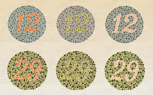
Even something as simple as picking the background colours for your website can have a huge impact on your website’s accessibility. A large percentage of the population have issues with colour blindness and some people may find it impossible to view your site based simply on your choice of colours, let alone the different connotations of colour schemes across geographies.
Luckily, W3C have guidelines designed to help web designers avoid many of these pitfalls and eliminate (as much as possible) the issues on your site which can lead to a negative user experience. There are some good plugins for Firefox that analyse the colour contrasts on your site and tell you if they meet the minimum requirements for people with different colour blindness conditions.
So I hope you now know that an accessible website naturally means a more usable website for a larger number of your visitors. Following the best practices I have covered will ensure you do not alienate your website visitors and also create user confidence in your site and your brand as a whole and ultimately, increase your conversion rates.

[…] Understanding The Impact Of Usability And Accessibility On Your Conversion Rate [Multilingual Search] […]
[…] from your visitors, you could be turning them away with simple – and easily fixed – mistakes. Multilingual Search investigates the ways usability and accessibility could be influencing your conversion […]
[…] Understanding The Impact Of Usability And Accessibility On Your … Posted in: Accessibility […]