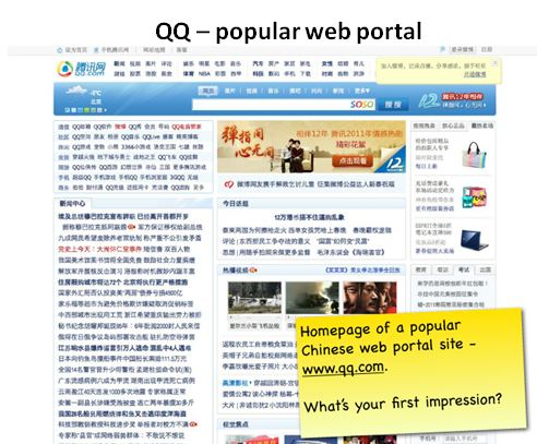
Many Western organisations have China on top of the agenda as the next destination for expansion and future growth. At a first glance, the business potential is staggering, however when researching the Chinese market more thoroughly, the prevailing cultural differences and legal complexities of setting up a business in China can prove too big a stumbling block for foreign companies to follow through.
While almost every aspect of doing business in China will require a special approach, today we will be looking at just one – and that is the link heavy nature of Chinese web design.
If you are a Westerner and have spent a few minutes looking at Chinese websites, you will know just how cluttered and complex most of them appear. However, what might strike a Westerner as an overwhelming overload of information is likely to be perceived as a content rich and intuitive site by the Chinese.
Source: Chui Chui Tan
The following is Barry Lloyd’s, President of Webcertain Asia, comments on what is causing this preference towards link heavy sites in China:
There is one reason in particular that mainland Chinese sites are incredibly link heavy, and that is that people tend to forget that full literacy in China is a relatively recent development and, when combined with the internet which also uses a “foreign” alphabet, there can be real issues of confidence when people are typing in things to their browser window or when searching through uncertainties with their spelling. This, in turn, has a huge impact on how people navigate to different sites and pages within a site.
This is not to say that the Chinese are bad readers. Far from it! But Simplified Chinese, which enabled the whole country to be able to read and write, was only really started as a process in 1952 and became introduced over the next 2 decades to become the form it is currently in – developing throughout this period. Officially, it is still under development and a series of further changes were put forward in 1977 but not generally taken up, and even as recently as 2009 public discussions were started on changing the language further – so no wonder people are confused on how to spell things!
Outside of mainland China (apart from Singapore), all other Chinese enclaves still use Traditional Chinese and in conversations these people make comparisons in that Simplified Chinese being established as a written language is similar to English speakers being told to read and write in the sort of short-hand used nowadays by people texting on their phones.
In discussions with Baidu recently, I was asking why one of the most popular sites in China is Hao123 – which is linked to by Baidu and is really nothing more than a series of links to other popular sites or popular topics. The answer? It is easier (and more reassuring) for Chinese people to follow a clearly written link than try and search for something where there may be a lot of different ways to type in the expression (Baidu themselves have over 200 character combinations that represent the phrase “weather forecast” that they need to parse).
It is also the reason that a large number of websites use numbers in their domains (you cannot misspell a number), as well as why QQ became the internet messenger application of choice, as people know how to type 12579623@qq.com, rather than barry.lloyd123@qq.com (as an example).
4399, one of the most popular sites with young people in China (who, on the whole, have received a better education generally than their parents), still has a home page that looks like a gigantic site map with hundreds of links on the page. This looks awful to Westerners who are accustomed to a subtle and clean look, yet perceived intuitive, attractive and helpful by the Chinese.
Again, this is not saying that you have to emulate this exactly at all – but in considering how any Chinese site should be developed, you should bear these factors in mind. The main point should be to make sure people feel comfortable and relaxed in being able to get to the information they are interested in finding once they have reached your site – it needs to be really easy for them to do so, if at all possible.


3 responses
Wow – reading this is really an epiphany. After years of living in Beijing, I have always been astounded and dismayed at how awful Chinese websites are. Tiny little fonts, terrible use of graphics, no attempt to channel visitors, painfully slow…
I’ve actually been waiting for an online banking or ecommerce site to “get it” and start applying Western design criteria here “pave the way to a whole new era in customer satisfaction”. Not going to happen! I’ve been culturally blind. Kind of embarrassing.
Language in China is so important. It permeates practically every thought. Why shouldn’t it guide people’s aesthetic response to a web site? I totally get the lack of confidence whenever you type something on the keyboard. People are after convenience, which means no typing. Trying to type in pinyin to get where you want to go is a huge obstacle to everything online. A page that shows every conceivable link is the very definition of convenience – fascinating!
I wonder if this explains why the rules of good presentation design are similarly disregarded here? In Chinese slide decks, 12-point fonts, massively over-designed graphics and hard to decipher tables are the norm and seemingly well-accepted. Maybe this is somehow the same discussion?
Malaysian Chinese has been using Simplified Chinese for many years.
Very interesting..makes alot of sense