Introduction
Are you tired of your website’s landing pages falling flat and failing to convert visitors into customers? Or maybe you are setting up a landing page for the first time and need some tips. In this blog post, I will walk you through the essential elements of an effective landing page. Whether you are a seasoned marketer or just starting out, get ready to take your landing page to the next level!
What is a landing page?
A landing page serves as a specific call-to-action page on a website, where users are expected to take a particular action. This can be anything from making a purchase, to signing up for an event, or subscribing to a newsletter. Its significance lies in the fact that users usually land on this page either through paid or organic campaigns.
Creating an effective landing page requires you to consider several factors, but the most crucial aspect is identifying its objective. It is essential to determine what action you want the user to take and what impression you want to make on them. To achieve this, you need to identify your target audience and tailor the landing page to meet their specific needs, enabling them to take the desired action as soon as they land on the page.
So, once you have defined your target audience and objective, what should you take into account when optimising your landing page? Let’s take a look at nine key areas.
1. The layout
The layout of a landing page is crucial in determining the user’s experience. It is analogous to meeting a person for the first time where one takes note of their facial expressions, energy and even the firmness of their handshake. All these factors combined create a lasting first impression.
Similarly, the layout of a landing page can either make or break a user’s perception of a brand. An unorganised layout, with multiple clashing colours that do not work well together and unclear messaging, can confuse a user and create a negative brand perception.
It is important to keep in mind that layout expectations can vary depending on the target market, which is why it is vital to do your research when you adapt your landing pages to different markets.
For example, in Japan, a busy layout with lots of information upfront is preferred, whilst in most Western countries, a more concise and minimal design is favoured.
By taking into account the layout preferences of your target market, you can create a landing page that is more likely to resonate with visitors and ultimately drive conversions.
2. The text
Your landing page should not contain more than 500 to 1,000 words – and will probably need even less. Compile all the vital information into a short introduction and create bullet points to communicate the core message you are trying to get across.
Since the landing page cannot be crammed with every single piece of information that exists about your company, you need to make sure the text on the page is carefully selected to be as impactful as possible. Emphasise the benefits of your product/service, and if possible include numbers and statistics, as these are easy to display and quick to take in at a glance.
Make sure to include a clear, prominent call-to-action at the top of the page, as this is essential to guide users to take the appropriate action. Highlighting the call-to-action by using a different colour or size can improve its visibility.

Testimonials from satisfied customers or clients can also significantly improve the effectiveness of your landing page. A short video (no more than two minutes) or a quote from customers is sufficient.
Keep the font size over 12pt, so that text is easy to read. If possible, you should optimise your landing page so that it responsively displays text in the best size for desktops (16 to 20pt), mobile phones (12 to 16pt) and tablets (15 to 19pt).
And, of course, the content on your landing page should be written in the local language of the target market. Use professional, native copywriters and/or translators to do this, to ensure the content on your page is of the highest quality.
3. The visuals
People remember more of what they see rather than what they read, so choose visuals that illustrate what you have to offer. The quality of your images needs to be high, without blurriness or distortion. They need to be relevant and consistent, and they are supposed to enhance your credibility. Good visuals improve the user’s experience and should be attention-grabbing and convey the necessary information.
To establish a strong connection with your target audience, ensure that any models used on your landing pages reflect the local demographics. For instance, it may be necessary to use different visuals for a landing page intended for a Norwegian audience, versus a South African one, versus a Japanese one. By tailoring your images to the different target demographics, this will help create more relatable and engaging landing pages for visitors from different regions, which could have a big impact on your conversions.
4. The colours
Colours on the page – be that on the page itself, text or visuals – should be consistent with your brand. Use colours that complement each other and avoid using too many colours, as that can make the page look cluttered. Ensure that the colours have enough contrast that any text is readable.
Consider colour schemes that are accessible to people with colour vision deficiencies, as well as those who may be viewing the page in different lighting conditions.
You should also be aware that colours can have different connotations in different countries and cultures. For example, white is often associated with purity and innocence in Western countries, whilst in Asia the colour white is a symbol of mourning. Likewise, green is a symbol of wealth and prosperity in Islamic cultures, whilst in the West it is often associated with nature and tranquillity. The use of colours can also vary in different political and religious contexts.
When choosing colours for your landing page (especially when localising them to different markets), take into account the cultural and contextual associations of colours. This will help you to more deeply connect with your target audience and avoid potential misunderstandings and cultural missteps.
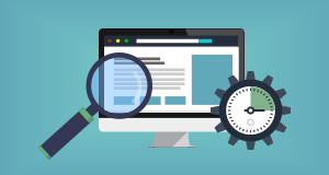
5. The loading speed
It is important that your landing page loads quickly. Page speed is a ranking factor on Google, with faster pages getting ranked higher on the search engine. It is also important for user experience, as there is nothing more frustrating than waiting for a very slow page to load!
Make sure to test your landing page’s speed in its target market. For example, if a landing page is targeting Germany, test its speed in Germany, not in your HQ in the US. This is important as page speeds can differ in different locations.
If the page loading speed is slower than expected, consider hosting your landing page on a local server located in the target market. You should also compress any images (whilst making sure not to lose the quality), remove any unused code and reduce re-directs.
6. Device optimisation
Make sure that your landing page is optimised to display responsively across all the most common device types (e.g. computers, mobile phones, tablets).
If your landing page is not optimised to be responsive, users on certain devices may have a poor experience on your website, which can lead to lower conversions, increased bounce rates and reduced engagement.
Make sure your font sizes are easy to read on all devices, ensure buttons and links are large enough to be easily clicked on touch screens, and ensure the page loads quickly on all devices.
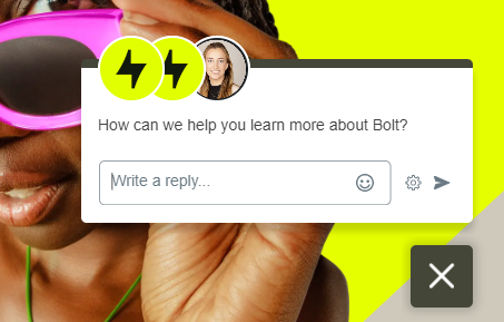
7. Chat tools
Having a chat tool on your landing page can improve the customer experience, as it offers users an immediate way to communicate with your company. A chat tool can provide quick answers and can help alleviate any doubts or hesitations, which can result in higher conversion rates and more leads or sales.
It can also provide you with insights on what your prospective customers need help with. By analysing the chat transcripts, you can identify any common questions or issues that users have, so that you can work on improving this.
If you decide to put a chat tool on your landing page, make sure that this is available in the language relevant to your target audience and their location.
8. A/B testing
Do not forget to test any changes you make. By A/B testing, you can experiment with different variations of your landing page and determine which one performs better. This enables you to make data-driven decisions about the content and design, rather than relying on assumptions.
9. Special considerations for international markets
When you have different landing pages targeting different international markets, there are certain things you have to take into consideration, so that the pages are localised to be as impactful as possible in each target market. We have already mentioned the following:
- Research the favoured landing page layout of the target market.
- Create content in the local language using professional native copywriters and/or translators.
- Use models that reflect the local demographics.
- Be aware that colours can have different connotations in different countries and cultures.
You should also make sure to adhere to the following additional best practices:
- Change any country-specific variables, e.g. units of measurement, currency, popular payment options, contact telephone numbers, business addresses, etc.
- Comply with all legal requirements in the country.
- Ensure any video content has subtitles or voiceovers in the target language, and change any country-specific information in the video.
- Research favoured content formats in different markets, as well as any current trends.
Conclusion
I hope that this blog post has given you the knowledge needed to unlock the power of your landing pages! Remember that the key to any successful landing page is to keep it focused on the needs of your target audience.
Whether you are looking to generate leads, increase conversions or improve your online marketing efforts, creating an optimised landing page can help you achieve your goals. Do not be afraid to experiment and test different designs, layouts and copy to find what works best for your specific audience and business.
If you would like some bespoke consultancy on how to create or improve your landing pages, the expert team at Webcertain are here to help! Just get in touch using this contact form and one of our team members will be thrilled to get back to you.
Good luck with your landing page optimisation efforts!
Marthe Kvernvik
Latest posts by Marthe Kvernvik (see all)
- 9 steps to unlock the power of your landing pages - May 15, 2023


Interesting tips, Marthe! I wonder if you have a strong opinion about splitting the landing page into components with CTA for each of those, as oppose to the homogeneous text?