After reading Ben’s recent blog post International Website Conversion: 3 Ways to Build User Trust it got me thinking about the importance of adapting websites to suit their intended international market, and when developing a multilingual website everything that Ben discussed is true. It really does pay to do your research, especially when it comes to e-commerce websites.
The question now is, after all this hard work, how can you guarantee that your site is fit for purpose and suitable for the end user? One suggestion is that once you have your multilingual website in test-mode you should carry out an Online QA, replicating the customer journey through your site.
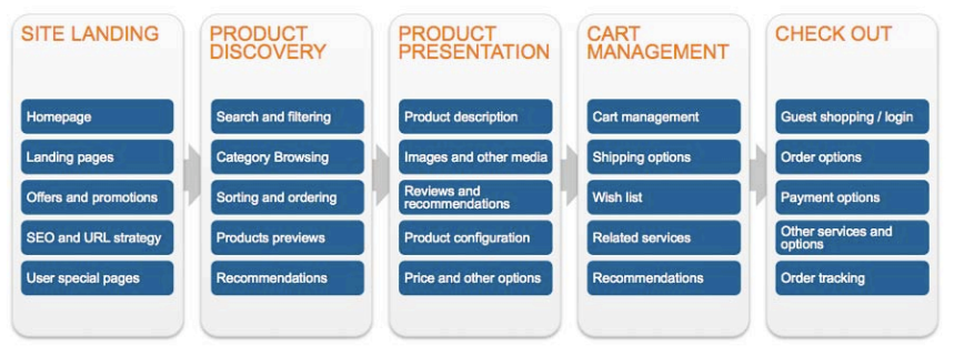
The successful implementation of quality assurance procedures such as an Online QA will ensure that any areas of improvement or bugs are identified before your site is launched. The diagram below illustrates the five key stages of the user experience of an e-commerce site:

Initial Impressions
Within the first few seconds of landing on a site, a customer will make their decision as to whether to continue on their journey or to leave the site full stop. Ensuring that the content of your new site is well translated and suited to your target region, is an essential step to take during the development stage and may retain traffic to your site. Good quality translations will take context into consideration, and it is probably worth mentioning that Machine Translation Tools that are readily available online, like Google Translates for example, do not always produce translations which are context specific, and for an end user that can play a big part in their decision to stay on your site. A prospective customer is more likely to continue on their journey if your brand appears “local”.
On deciding to stay on your site, a customer will want to search your site with ease and simplicity, using appropriate local terms and key phrases. The easier this is the higher the chance they are to stay, so bear this in mind when developing your site.
Showcase Your Products
When it comes to presenting your catalogue of products it is again essential to consider the end user experience. Remember this is the only time a potential customer is exposed to your products before they eventually place them in their shopping cart. Market research has shown that customer reviews are significantly more trusted than the product descriptions that come from the manufacturers; by nearly 12 times more! It would be beneficial to either translate any existing reviews or comments already on your website, or source reviews directly from in-country customers or contacts in your target market.
Make It Easy
Once a customer has made the decision to add a particular product to their shopping cart they will want to see how easy it is to manage before completing their purchase. Features such as adding/removing products, changing the quantities of selected items, and the option to continue shopping should all be taken into consideration and made as easy to use as possible. At this stage in the customer journey there is a reported drop-out rate of 75% compared to the number of sales that make it to the checkout, so it is important to get this aspect of your site right!
The final stage of the customer journey sees your customer making their final purchase at the checkout. As outlined in Ben’s post, ensuring that the most appropriate methods of payment are available for each of your target markets is something which should be looked into during the development of your multilingual site. The more localised the better as it will build trust between your customer and your brand, potentially resulting in repeat business.
Check It Works
In the testing stage of your site it would be beneficial to have native speakers work their way through your website and replicate the customer experience for themselves. From a customer’s first impression of your landing page to the ease of completing their transaction, an Online QA will provide you with feedback on aspects of each of the five steps of the e-commerce customer journey illustrated above, allow you to make improvements before your site eventually goes live and give you the best possible chance of seeing the sales come flooding in.


2 responses
If your thinking of making an international website, don’t try to use Google translate and think it will be OK, just translate a German site into English for example with Google translate to see how bad it is, do you really want your customers to see that as their first impression of you.
Couldn’t agree more with the make it easy part, I noticed people like it when they can make a purchase without having to login/register. reducing the waiting time for possible customers and so makes it less likely for them to quit before finishing the purchase.